
Input Group ใน Bootstrap 5 เป็นเครื่องมือที่ช่วยให้เราสามารถรวมองค์ประกอบต่าง ๆ เข้ากับฟอร์มของเราเพื่อเพิ่มความสะดวกในการใช้งาน ไม่ว่าจะเป็นการเพิ่มปุ่ม ไอคอน หรือข้อความต่าง ๆ ก่อนหรือหลังช่องกรอกข้อมูล (input field) เพื่อให้การออกแบบฟอร์มดูสวยงามและมีฟังก์ชันการทำงานที่สมบูรณ์ยิ่งขึ้น
วิธีการใช้งาน Input Group เบื้องต้น
การใช้งาน Input Group ใน Bootstrap 5 สามารถทำได้โดยการใช้คลาส .input-group ร่วมกับคลาสอื่น ๆ เพื่อจัดเรียงองค์ประกอบต่าง ๆ ให้ปรากฏก่อนหรือหลังช่องกรอกข้อมูล ตัวอย่างเช่น
<div class="input-group">
  <span class="input-group-text" id="basic-addon1">@</span>
  <input type="text" class="form-control" placeholder="Username" aria-label="Username" aria-describedby="basic-addon1">
</div>
ในตัวอย่างข้างต้น เราได้ใช้คลาส .input-group-text เพื่อเพิ่มสัญลักษณ์ @ ก่อนช่องกรอกข้อมูล โดยที่ช่องกรอกข้อมูลใช้คลาส .form-control เพื่อให้การแสดงผลเป็นไปตามสไตล์ของ Bootstrap
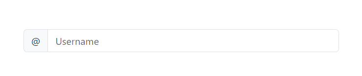
ตัวอย่างการใช้งาน Input Group ในรูปแบบต่าง ๆ
Input Group พร้อมข้อความก่อนและหลัง
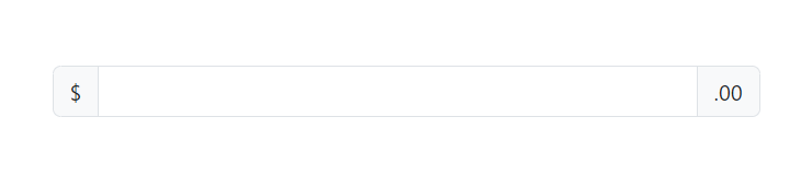
เราสามารถเพิ่มข้อความได้ทั้งก่อนและหลังช่องกรอกข้อมูลโดยใช้คลาส .input-group-text
<div class="input-group mb-3">
  <span class="input-group-text" id="basic-addon1">$</span>
  <input type="text" class="form-control" aria-label="Amount (to the nearest dollar)">
  <span class="input-group-text">.00</span>
</div>
ในตัวอย่างนี้จะมีข้อความ $ แสดงด้านหน้าของช่องกรอกข้อมูล และ .00 แสดงด้านหลัง
Input Group พร้อมปุ่ม
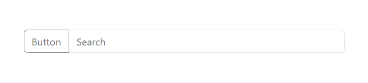
เราสามารถเพิ่มปุ่มร่วมกับช่องกรอกข้อมูลได้ โดยใช้คลาส .btn ร่วมกับ .input-group
<div class="input-group mb-3">
  <button class="btn btn-outline-secondary" type="button" id="button-addon1">Button</button>
  <input type="text" class="form-control" placeholder="Search" aria-label="Example text with button" aria-describedby="button-addon1">
</div>
ในตัวอย่างนี้จะมีปุ่มแสดงด้านซ้ายของช่องกรอกข้อมูลเพื่อทำหน้าที่ในการส่งค่าหรือทำการค้นหา
Input Group พร้อม Dropdown
เราสามารถเพิ่มเมนูแบบ dropdown ร่วมกับช่องกรอกข้อมูลได้
<div class="input-group mb-3">
  <button class="btn btn-outline-secondary dropdown-toggle" type="button" data-bs-toggle="dropdown" aria-expanded="false">Dropdown</button>
  <ul class="dropdown-menu">
    <li><a class="dropdown-item" href="#">Action 1</a></li>
    <li><a class="dropdown-item" href="#">Action 2</a></li>
    <li><a class="dropdown-item" href="#">Action 3</a></li>
  </ul>
  <input type="text" class="form-control" aria-label="Text input with dropdown button">
</div>
ในตัวอย่างนี้จะมีปุ่ม Dropdown ที่แสดงตัวเลือกต่าง ๆ อยู่ด้านซ้ายของช่องกรอกข้อมูล

Input Group พร้อม Checkbox และ Radio Button
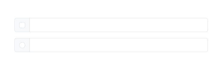
เราสามารถเพิ่ม Checkbox หรือ Radio Button ด้านหน้าช่องกรอกข้อมูลได้
<!-- Input Group with Checkbox -->
<div class="input-group mb-3">
  <div class="input-group-text">
    <input class="form-check-input mt-0" type="checkbox" value="" aria-label="Checkbox for following text input">
  </div>
  <input type="text" class="form-control" aria-label="Text input with checkbox">
</div>

<!-- Input Group with Radio -->
<div class="input-group">
  <div class="input-group-text">
    <input class="form-check-input mt-0" type="radio" value="" aria-label="Radio button for following text input">
  </div>
  <input type="text" class="form-control" aria-label="Text input with radio button">
</div>
ตัวอย่างนี้แสดงการเพิ่ม Checkbox และ Radio Button ร่วมกับช่องกรอกข้อมูลเพื่อให้ผู้ใช้สามารถเลือกตัวเลือกต่าง ๆ ได้ก่อนที่จะกรอกข้อมูล
Input Group ขนาดเล็ก กลาง และใหญ่
เราสามารถปรับขนาดของ Input Group ได้โดยใช้คลาส .input-group-sm และ .input-group-lg สำหรับขนาดเล็กและใหญ่
<!-- Input Group ขนาดเล็ก -->
<div class="input-group input-group-sm mb-3">
  <span class="input-group-text" id="inputGroup-sizing-sm">Small</span>
  <input type="text" class="form-control" aria-label="Small input" aria-describedby="inputGroup-sizing-sm">
</div>

<!-- Input Group ขนาดกลาง (ค่าเริ่มต้น) -->
<div class="input-group mb-3">
  <span class="input-group-text" id="inputGroup-sizing-default">Default</span>
  <input type="text" class="form-control" aria-label="Default input" aria-describedby="inputGroup-sizing-default">
</div>

<!-- Input Group ขนาดใหญ่ -->
<div class="input-group input-group-lg">
  <span class="input-group-text" id="inputGroup-sizing-lg">Large</span>
  <input type="text" class="form-control" aria-label="Large input" aria-describedby="inputGroup-sizing-lg">
</div>
Input Group ร่วมกับการอัปโหลดไฟล์
เราสามารถใช้งาน Input Group เพื่อแสดงช่องกรอกข้อมูลร่วมกับปุ่มอัปโหลดไฟล์ได้
<div class="input-group mb-3">
  <input type="file" class="form-control" id="inputGroupFile02">
  <label class="input-group-text" for="inputGroupFile02">Upload</label>
</div>
ในตัวอย่างนี้แสดงการใช้งานช่องกรอกข้อมูลที่มีปุ่มสำหรับการเลือกไฟล์เพื่ออัปโหลด

สรุป
การใช้งาน Input Group ใน Bootstrap 5 ช่วยให้การสร้างฟอร์มมีความยืดหยุ่นมากยิ่งขึ้น เราสามารถปรับแต่งองค์ประกอบต่าง ๆ เช่น ข้อความ ไอคอน ปุ่ม หรือแม้กระทั่ง Dropdown และ Checkbox ให้รวมอยู่กับช่องกรอกข้อมูลได้ ทำให้การออกแบบฟอร์มดูสวยงาม