
Progress Bar ก็คือ แถบสถานะที่บ่งบอกความคืบหน้าของงานหรือกิจกรรมบางอย่าง เพื่อให้รู้ว่างานนั้น ๆ คืบหน้าไปแล้วเท่าไหร่ ใกล้เสร็จหรือยัง เป็นต้น
เราสามารถใช้ Bootstrap 5 สร้าง Progress Bar ได้ โดยการสร้างเอลิเมนต์ <div> ขึ้นมา 1 อัน เพื่อทำหน้าที่เป็น Container และกำหนดคลาส .progress ให้กับเอลิเมนต์ดังกล่าว
หลังจากนั้น สร้างเอลิเมนต์ <div> ขึ้นมาอีกหนึ่งอัน ภายในเอลิเมนต์ <div> ที่สร้างไว้ทีแรก และกำหนดคลาส .progress-bar และในเอลิเมนต์เดียวกันนี้ ให้กำหนด style width เป็นเปอร์เซ็นต์ เพื่อกำหนดความกว้างของ Progress Bar ดังตัวอย่าง
  <div class="progress">
    <div class="progress-bar" style="width:50%"></div>
  </div>
การกำหนดความสูงให้ Progress Bar
ความสูงของ Progress Bar จะอยู่ที่ 1rem (ประมาณ 16px) แต่เราสามารถกำหนดความสูงของ Progress Bar เองได้ โดยการกำหนดพร็อพเพอร์ตี้ height โดยต้องกำหนด 2 จุด คือทั้งที่ Container และที่ตัว Progress Bar
  <div class="progress" style="height:20px;">
    <div class="progress-bar" style="width:50%; height:20px;"></div>
  </div>
  <br>
  <div class="progress" style="height:30px;">
    <div class="progress-bar" style="width:80%; height:30px;"></div>
  </div>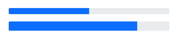
การแสดงข้อความกำกับ Progress Bar
ถ้าต้องการแสดงข้อความกำกับ Progress Bar เพื่อบ่งบอกบางอย่าง เช่น บ่งบอกสถานะ บ่งบอกเปอร์เซ็นต์ความคืนหน้า เป็นต้น ก็สามารถทำได้เช่ยเดียวกัน
  <div class="progress" style="height:20px;">
    <div class="progress-bar" style="width:50%; height:20px;">50%</div>
  </div>
  <br>
  <div class="progress" style="height:30px;">
    <div class="progress-bar" style="width:80%; height:30px;">กำลังดำเนินการ 80%</div>
  </div>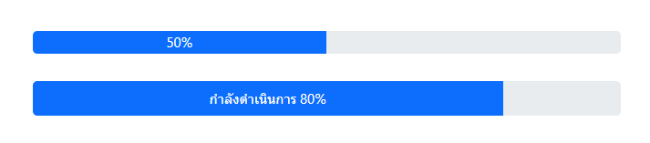
การกำหนดสีสันให้ Progress Bar
โดยปกติ Progress Bar จะเป็นสีน้ำเงิน (primary) แต่เราสามารถกำหนดสีให้ Progress Bar เป็นสีอื่น ๆ ได้ โดยใช้คลาสประเภท contextual background classes ดังนี้
  <div class="progress" style="height:30px;">
    <div class="progress-bar bg-primary" style="width:20%; height:30px;">กำลังดำเนินการ 20%</div>
  </div>
  <br>
  <div class="progress" style="height:30px;">
    <div class="progress-bar bg-success" style="width:25%; height:30px;">กำลังดำเนินการ 25%</div>
  </div>
  <br>
  <div class="progress" style="height:30px;">
    <div class="progress-bar bg-info" style="width:30%; height:30px;">กำลังดำเนินการ 30%</div>
  </div>
  <br>
  <div class="progress" style="height:30px;">
    <div class="progress-bar bg-warning" style="width:35%; height:30px;">กำลังดำเนินการ 35%</div>
  </div>
  <br>
  <div class="progress" style="height:30px;">
    <div class="progress-bar bg-danger" style="width:40%; height:30px;">กำลังดำเนินการ 40%</div>
  </div>
  <br>
  <div class="progress" style="height:30px;">
    <div class="progress-bar bg-white" style="width:45%; height:30px;">กำลังดำเนินการ 45%</div>
  </div>
  <br>
  <div class="progress" style="height:30px;">
    <div class="progress-bar bg-gray" style="width:50%; height:30px;">กำลังดำเนินการ 50%</div>
  </div>
  <br>
  <div class="progress" style="height:30px;">
    <div class="progress-bar bg-light" style="width:55%; height:30px;">กำลังดำเนินการ 55%</div>
  </div>
  <br>
  <div class="progress" style="height:30px;">
    <div class="progress-bar bg-dark" style="width:60%; height:30px;">กำลังดำเนินการ 60%</div>
  </div>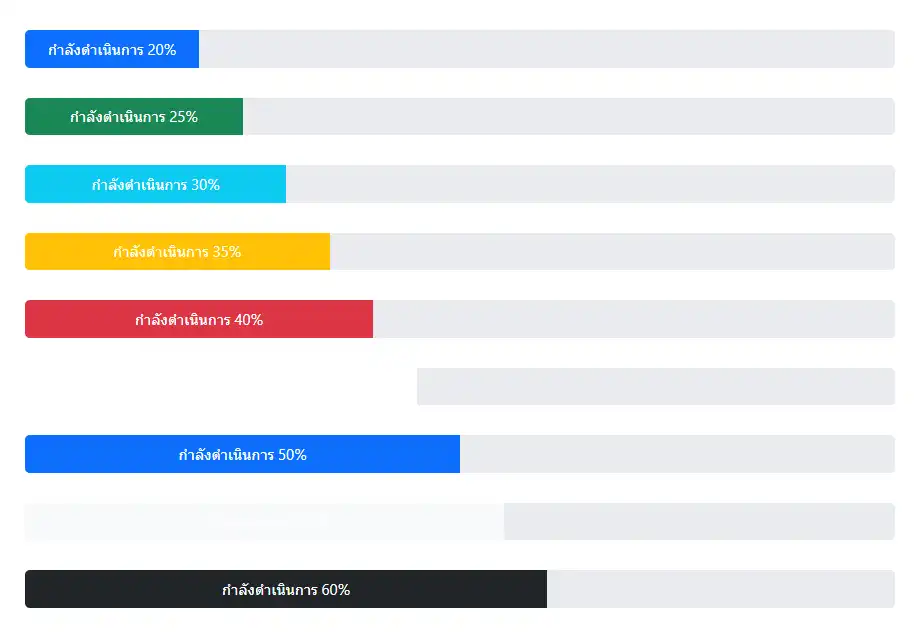
Progress Bar แบบ Striped
ถ้าไม่ชอบ Progress Bar แบบสีเดียวทึบ ๆ ก็สามารถสร้าง Progress Bar แบบ Striped ได้ โดยใช้งานคลาส .progress-bar-striped
  <div class="progress">
    <div class="progress-bar bg-primary progress-bar-striped" style="width:20%;">กำลังดำเนินการ 20%</div>
  </div>
  <br>
  <div class="progress">
    <div class="progress-bar bg-success progress-bar-striped" style="width:25%;">กำลังดำเนินการ 25%</div>
  </div>
  <br>
  <div class="progress">
    <div class="progress-bar bg-info progress-bar-striped" style="width:30%;">กำลังดำเนินการ 30%</div>
  </div>
  <br>
  <div class="progress">
    <div class="progress-bar bg-warning progress-bar-striped" style="width:35%;">กำลังดำเนินการ 35%</div>
  </div>
  <br>
  <div class="progress">
    <div class="progress-bar bg-danger progress-bar-striped" style="width:40%;">กำลังดำเนินการ 40%</div>
  </div>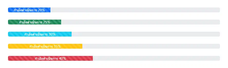
Progress Bar แบบเคลื่อนไหว
ถ้า Progress Bar แบบนิ่ง ๆ มันดูเชยเกินไป หรือไม่น่าสนใจ เราก็สามารถสร้าง Progress Bar แบบเคลื่อนไหวนิด ๆ ได้เช่นกัน โดยการใช้งานคลาส .progress-bar-animated
  <div class="progress">
    <div class="progress-bar bg-primary progress-bar-striped progress-bar-animated" style="width:20%;">กำลังดำเนินการ 20%</div>
  </div>
  <br>
  <div class="progress">
    <div class="progress-bar bg-success progress-bar-striped progress-bar-animated" style="width:25%;">กำลังดำเนินการ 25%</div>
  </div>
  <br>
  <div class="progress">
    <div class="progress-bar bg-info progress-bar-striped progress-bar-animated" style="width:30%;">กำลังดำเนินการ 30%</div>
  </div>
  <br>
  <div class="progress">
    <div class="progress-bar bg-warning progress-bar-striped progress-bar-animated" style="width:35%;">กำลังดำเนินการ 35%</div>
  </div>
  <br>
  <div class="progress">
    <div class="progress-bar bg-danger progress-bar-striped progress-bar-animated" style="width:40%;">กำลังดำเนินการ 40%</div>
  </div>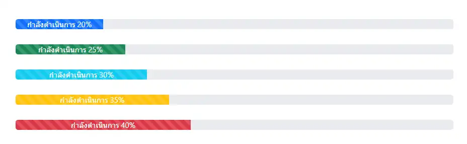
Progress Bar หลายอัน อยู่ด้วยกัน
เราสามารถสร้าง Progress Bar หลาย ๆ อัน ให้อยู่ด้วยกันได้ โดยการสร้างไว้ภายใน Container เดียวกัน
  <div class="progress">
    <div class="progress-bar bg-success" style="width:20%;">งานที่สำเร็จแล้ว 20%</div>
    <div class="progress-bar bg-warning" style="width:20%;">งานที่กำลังทำ 20%</div>
    <div class="progress-bar bg-danger" style="width:60%;">งานค้าง 60%</div>
  </div>