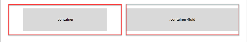
การใช้งานคลาสต่าง ๆ ของ Bootstrap เพื่อตกแต่งเว็บไซต์ ต้องทำภายใต้ตัวบรรลุ หรือที่เรียกว่า Container ซึ่งใน Bootstrap 5 มีคลาสสำหรับกำหนด Container 2 ตัว คือ
- คลาส
.containerสำหรับกำหนด Container แบบ fixed width container คือตัวบรรจุที่มีความกว้างคงที่ - คลาส
.container-fluidสำหรับกำหนด Container แบบ full width container คือตัวบรรจุที่มีความกว้างเต็มขนาดหน้าจอ
เพื่อความเข้าใจที่ชัดเจนขึ้น ให้ดูรูปด้านล่างเพื่อสังเกตความแตกต่างด้านความกว้างของ Container ทั้ง 2 แบบ
Fixed Container
Fixed Container หรือ ตัวบรรจุที่มีความกว้างคงที่ จะมีความกว้างสูงสุด (max-width) แบบคงที่ (เปลี่ยนตามขนาดหน้าจออุปกรณ์) ดังนี้
| Extra small <576px | Small ≥576px | Medium ≥768px | Large ≥992px | Extra Large ≥1200px | XXLarge ≥1400px | |
|---|---|---|---|---|---|---|
| max-width | 100% | 540px | 720px | 960px | 1140px | 1320px |
- บนอุปกรณ์ที่มีหน้าจอขนาดเล็กเป็นพิเศษ (Extra small) คือความละเอียดหน้าจอน้อยกว่า 576px Fixed Container จะมีความกว้าง 100%
- บนอุปกรณ์ที่มีหน้าจอขนาดเล็ก (Small) คือความละเอียดหน้าจอมากกว่าหรือเท่ากับ 576px Fixed Container จะมีความกว้าง 540px
- บนอุปกรณ์ที่มีหน้าจอขนาดปานกลาง (Medium) คือความละเอียดหน้าจอมากกว่าหรือเท่ากับ768px Fixed Container จะมีความกว้าง 720px
- บนอุปกรณ์ที่มีหน้าจอขนาดใหญ่ (Large) คือความละเอียดหน้าจอมากกว่าหรือเท่ากับ 992px Fixed Container จะมีความกว้าง 960px
- บนอุปกรณ์ที่มีหน้าจอขนาดใหญ่เป็นพิเศษ (Extra large) คือความละเอียดหน้าจอมากกว่าหรือเท่ากับ 1200px Fixed Container จะมีความกว้าง 1140px
- บนอุปกรณ์ที่มีหน้าจอขนาดใหญ่มาก (XXLarge) คือความละเอียดหน้าจอมากกว่าหรือเท่ากับ 1400px Fixed Container จะมีความกว้าง 1320px
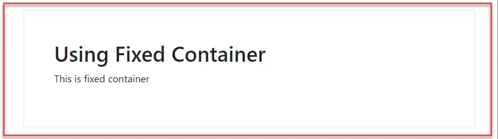
ตัวอย่างการใช้งาน Fixed Container ให้ใช้คลาส .container ดังนี้
<div class="container">
  <h1>Using Fixed Container</h1>
  <p>This is fixed container</p>
</div>
Fluid Container
Fluid Container หรือตัวบรรจุที่มีความยึดหยุดตามอุปกรณ์ คือตัว Container จะปรับความกว้างตามขนาดหน้าจออุปกรณ์ที่แสดงผลอยู่ในขณะนั้น โดยความหมายก็คือ จะมีความกว้างแบบ full width คือเต็มหน้าจอ (100%) ตลอดเวลานั่นเอง
เราสามารถใช้งาน Fluid Container ได้โดยการใช้คลาส .container-fluid ดังนี้
<div class="container-fluid">
  <h1>Using Fluid Container</h1>
  <p>This is fluid container</p>
</div>
Container Padding
โดยปกติ Container ของ Bootstrap จะกำหนดระยะห่างระหว่างเนื้อหากับขอบด้านใน (Padding) ของ Container เอาไว้ โดยจะมีเฉพาะด้านซ้ายและด้านขวาเท่านั้น ด้านบนและด้านล่างไม่ได้กำหนดไว้ แต่เราสามารถกำหนดเพิ่มเติมได้โดยการเพิ่มคลาสเข้ามา เช่น .pt-5 และ .pb-5 เป็นการเพิ่มระยะห่างระหว่างเนื้อหากับขอบด้านบนและด้านล่าง ด้านละ 5px ดังตัวอย่าง
<div class="container pt-5 pb-5">
  <h1>Using Fixed Container</h1>
  <p>This is fixed container</p>
</div>- บรรทัดที่ 1 เพิ่มคลาส
.pt-5และ.pb-5เข้ามา เพื่อกำหนดระยะห่างระหว่างเนื้อหากับขอบด้านบนและด้านล่าง ด้านละ 5px
หรือเราจะใช้คลาส .p ตามด้วยตัวเลข เพื่อกำหนดระยะหว่างระหว่างเนื้อหากับขอบด้านในด้านละเท่า ๆ กันก็ได้ (บน ล่าง ซ้าย ขวา) เช่น .p-5 จะเป็นการกำหนด padding ด้านละ 5px
<div class="container p-5">
  <h1>Using Fixed Container</h1>
  <p>This is fixed container</p>
</div>- บรรทัดที่ 1 เพิ่มคลาส
.p-5เข้ามา เพื่อกำหนดระยะห่างระหว่างเนื้อหากับขอบทั้ง 4 ด้าน ด้านละ 5px
เส้นขอบและสีของ Container
เราสามารถกำหนดเส้นขอบและสีให้ Container ได้เช่นกัน
ถ้าต้องการกำหนดให้ Container แสดงเส้นขอบ สามารถทำได้โดยการเพิ่มคลาส .border ดังนี้
<div class="container p-5 my-3 border">
  <h1>Using Fixed Container</h1>
  <p>This is fixed container</p>
</div>- บรรทัดที่ 1 เพิ่มคลาส
.borderเข้ามา เพื่อให้ Container แสดงเส้นขอบ
ผลลัพธ์ จะเห็นว่า ที่ตัว Container มีเส้นขอบแสดงอยู่
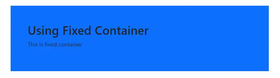
ถ้าต้องการกำหนดสีพื้นหลังให้ Container ก็สามารถทำได้โดยใช้คลาสสำหรับกำหนดสีพื้นหลังตัวใดตัวหนึ่ง ดังนี้ .bg-primary, .bg-success, .bg-info, .bg-warning, .bg-danger, .bg-secondary, .bg-dark หรือ .bg-light. ดังตัวอย่าง
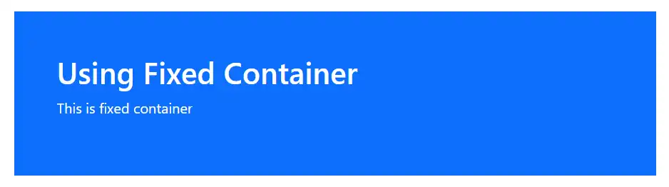
<div class="container p-5 my-3 bg-primary">
  <h1>Using Fixed Container</h1>
  <p>This is fixed container</p>
</div>- บรรทัดที่ 1 เพิ่มคลาส
.bg-primaryเข้าไปใน Container เพื่อกำหนดสีพื้นหลังเป็นสีน้ำเงิน
โดยปกติ สีตัวอักษรจะถูกำหนดให้เป็นสีดำเป็นค่าเริ่มต้น แต่ถ้าต้องการกำหนดสีตัวอักษรเป็นสีอื่น ๆ สามารถทำได้โดยการใช้คลาสสำหรับกำหนดสีตัวอักษร คลาสใดคลาสหนึ่งดังนี้ .text-muted, .text-primary, .text-success, .text-info, .text-warning, .text-danger, .text-secondary, .text-white, .text-dark, .text-body ดังตัวอย่าง
<div class="container p-5 my-3 bg-primary text-white">
  <h1>Using Fixed Container</h1>
  <p>This is fixed container</p>
</div>- บรรทัดที่ 1 เพิ่มคลาส
.text-whiteเข้ามา เพื่อกำหนดสีตัวอักษรเป็นสีขาว
Responsive Containers
เราสามารถกำหนดได้ว่าจะให้ Container แสดงผลแบบ responsive เมื่ออยู่บนหน้าจอขนาดใด โดยใช้คลาส .container-sm|md|lg|xl แล้วความกว้างสูงสุดของ Container จะเปลี่ยนไปตามขนาดของหน้าจอแสดงผล ซึ่งมีรายละเอียดการแสดงผลของคลาสแต่ละตัว ดังนี้
| Class | Extra small <576px | Small ≥576px | Medium ≥768px | Large ≥992px | Extra large ≥1200px | XXLarge ≥1400px |
|---|---|---|---|---|---|---|
.container-sm | 100% | 540px | 720px | 960px | 1140px | 1320px |
.container-md | 100% | 100% | 720px | 960px | 1140px | 1320px |
.container-lg | 100% | 100% | 100% | 960px | 1140px | 1320px |
.container-xl | 100% | 100% | 100% | 100% | 1140px | 1320px |
.container-xxl | 100% | 100% | 100% | 100% | 100% | 1320px |
ตัวอย่างการใช้งาน
<div class="container-sm p-2 my-3 border">
    <h1>Using class .container-sm</h1>
</div>
<div class="container-md p-2 my-3 border">
    <h1>Using class .container-md</h1>
</div>
<div class="container-lg p-2 my-3 border">
    <h1>Using class .container-lg</h1>
</div>
<div class="container-xl p-2 my-3 border">
    <h1>Using class .container-xl</h1>
</div>
<div class="container-xxl p-2 my-3 border">
    <h1>Using class .container-xxl</h1>
</div>