Input คือ ข้อมูลที่ผู้ใช้ใส่หรือกรอกลงในโปรแกรมหรือระบบคอมพิวเตอร์ เพื่อให้โปรแกรมนั้นทำงานต่อไป โดยทั่วไป “Input” จะถูกนำมาใช้ในฟอร์มหรืออินเทอร์เฟซของเว็บไซต์หรือแอปพลิเคชันเพื่อเก็บข้อมูลจากผู้ใช้ เช่น การกรอกข้อความ การเลือกตัวเลือก การกรอกตัวเลข หรือการอัปโหลดไฟล์
การใช้ Input ใน Bootstrap 4 มีหลายรูปแบบและวิธีการประยุกต์ใช้งาน โดย Bootstrap 4 มาพร้อมกับคลาสและเครื่องมือที่ช่วยให้การออกแบบ Input ในฟอร์มเป็นไปอย่างง่ายดายและมีความสวยงาม มาดูรูปแบบการใช้งานต่างๆ ของ Input ใน Bootstrap 4 กันครับ
Input แบบพื้นฐาน (Basic Input)
ฟอร์ม Input แบบพื้นฐานสามารถใช้งานได้ด้วยการเพิ่มคลาส form-control ลงใน <input> เพื่อให้ Input มีลักษณะที่เป็นมาตรฐานของ Bootstrap 4
<div class="form-group">
    <label for="basicInput">ชื่อผู้ใช้</label>
    <input type="text" class="form-control" id="basicInput" placeholder="กรอกชื่อผู้ใช้">
</div>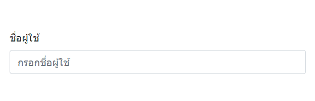
Input แบบขนาดต่างๆ (Input Sizes)
Bootstrap 4 รองรับการปรับขนาดของ Input ได้ โดยใช้คลาส form-control-lg สำหรับ Input ขนาดใหญ่ และ form-control-sm สำหรับ Input ขนาดเล็ก
<!-- Input ขนาดใหญ่ -->
<input class="form-control form-control-lg" type="text" placeholder="ขนาดใหญ่">

<!-- Input ขนาดเล็ก -->
<input class="form-control form-control-sm" type="text" placeholder="ขนาดเล็ก">
Input แบบมี Placeholder
ใช้ placeholder เพื่อแสดงข้อความที่เป็นคำใบ้หรือคำแนะนำให้ผู้ใช้
<input type="text" class="form-control" placeholder="กรอกข้อมูลที่นี่">Input สำหรับกรอกรหัสผ่าน (Password Input)
รูปแบบการใช้งานเหมือน Input ทั่วไป เพียงแต่กำหนด type="password"
<div class="form-group">
    <label for="passwordInput">รหัสผ่าน</label>
    <input type="password" class="form-control" id="passwordInput" placeholder="กรอกรหัสผ่าน">
</div>
Input แบบ File Upload
Bootstrap 4 รองรับการอัปโหลดไฟล์โดยใช้คลาส form-control-file
<div class="form-group">
    <label for="fileInput">อัปโหลดไฟล์</label>
    <input type="file" class="form-control-file" id="fileInput">
</div>
Input แบบ Disabled และ Readonly
สามารถตั้งค่า Input ให้ไม่สามารถแก้ไขได้ (Disabled) หรืออ่านได้อย่างเดียว (Readonly)
<!-- Disabled -->
<input type="text" class="form-control" placeholder="ไม่สามารถแก้ไขได้" disabled>

<!-- Readonly -->
<input type="text" class="form-control" value="อ่านได้เท่านั้น" readonly>
Input Group (การใช้งาน Input กับ Add-ons)
Bootstrap 4 รองรับการใช้งาน Input Group ที่มีการเพิ่มข้อความหรือไอคอนไว้ข้างหน้า (Prepend) หรือข้างหลัง (Append) ของ Input
<div class="input-group mb-3">
    <div class="input-group-prepend">
        <span class="input-group-text">@</span>
    </div>
    <input type="text" class="form-control" placeholder="ชื่อผู้ใช้">
</div>

<div class="input-group mb-3">
    <input type="text" class="form-control" placeholder="ค้นหา...">
    <div class="input-group-append">
        <span class="input-group-text">🔍</span>
    </div>
</div>
Input แบบ Checkbox และ Radio
การใช้งาน Checkbox และ Radio สามารถทำได้โดยใช้คลาส form-check
<!-- Checkbox -->
<div class="form-check">
    <input class="form-check-input" type="checkbox" id="check1">
    <label class="form-check-label" for="check1">
        ยอมรับเงื่อนไข
    </label>
</div>

<!-- Radio -->
<div class="form-check">
    <input class="form-check-input" type="radio" name="exampleRadios" id="radio1" value="option1" checked>
    <label class="form-check-label" for="radio1">
        ตัวเลือก 1
    </label>
</div>
Input แบบ Select
สำหรับการสร้าง Dropdown เลือกตัวเลือก สามารถใช้ select ร่วมกับคลาส form-control
<div class="form-group">
    <label for="exampleSelect">เลือกหมวดหมู่</label>
    <select class="form-control" id="exampleSelect">
        <option>หมวดหมู่ 1</option>
        <option>หมวดหมู่ 2</option>
        <option>หมวดหมู่ 3</option>
    </select>
</div>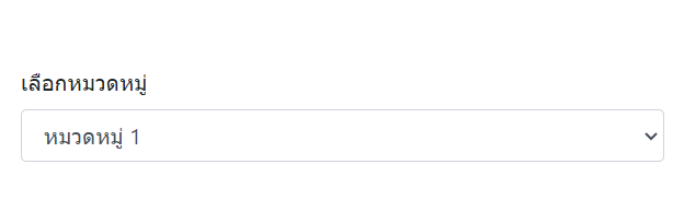
Input แบบ Textarea
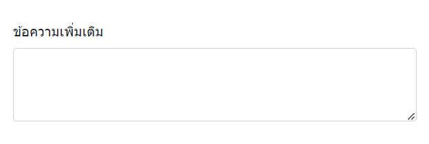
การใช้งาน Textarea สำหรับการกรอกข้อความยาว ๆ ก็สามารถใช้งานได้ผ่าน textarea ร่วมกับคลาส form-control
<div class="form-group">
    <label for="exampleTextarea">ข้อความเพิ่มเติม</label>
    <textarea class="form-control" id="exampleTextarea" rows="3"></textarea>
</div>