
Input Group คือองค์ประกอบหนึ่งใน Bootstrap 4 ที่ใช้ในการรวมฟิลด์ป้อนข้อมูล (input fields) เข้ากับองค์ประกอบอื่นๆ เช่น ป้ายชื่อ (label), ปุ่ม (button), ไอคอน (icon), หรือข้อความเสริม (addon) ไว้ในแถวเดียวกันอย่างเป็นระเบียบ Input Group ถูกออกแบบมาเพื่อช่วยให้อินพุตดูมีโครงสร้างที่สวยงาม สะดวกต่อการใช้งาน และง่ายต่อการเข้าใจข้อมูลที่ผู้ใช้ต้องกรอก
วัตถุประสงค์หลักของ Input Group
- เพิ่มความสวยงามและความเป็นระเบียบ: การนำป้ายชื่อ, สัญลักษณ์, หรือปุ่มมาไว้ใน Input Group ช่วยให้การจัดวางองค์ประกอบดูเป็นระเบียบ สะอาดตา และดูเป็นองค์รวมที่กลมกลืนกันมากขึ้น
- ปรับปรุงประสบการณ์ของผู้ใช้: เมื่อผู้ใช้เห็นฟิลด์ข้อมูลที่มีตัวบ่งชี้ เช่น สัญลักษณ์เงิน, ชื่อผู้ใช้ หรือปุ่มสำหรับการกระทำเฉพาะ การกรอกข้อมูลจะเข้าใจง่ายขึ้นและให้ความรู้สึกมั่นใจมากขึ้น
- การใช้งานที่ง่ายขึ้น: Input Group ช่วยให้สามารถรวมหลายฟังก์ชันเข้าด้วยกัน เช่น เพิ่มปุ่มสำหรับการส่งข้อมูลหรือค้นหาทันทีจากฟิลด์เดียว
ขั้นตอนการใช้งาน Input Group
- ใช้คลาสที่กำหนด: ใช้คลาส
input-groupเพื่อกำหนดเริ่มต้นของ Input Group และinput-group-prependหรือinput-group-appendเพื่อเพิ่มองค์ประกอบอื่น ๆ เช่น ป้ายชื่อหรือปุ่ม - กำหนดประเภทฟิลด์: ใช้
<input>เพื่อกำหนดประเภทข้อมูลที่ผู้ใช้ต้องกรอก
ตัวอย่างการใช้งาน Input Group
Input Group พร้อมป้ายชื่อ
<div class="input-group mb-3">
    <div class="input-group-prepend">
        <span class="input-group-text" id="basic-addon1">@</span>
    </div>
    <input type="text" class="form-control" placeholder="Username" aria-label="Username" aria-describedby="basic-addon1">
</div>
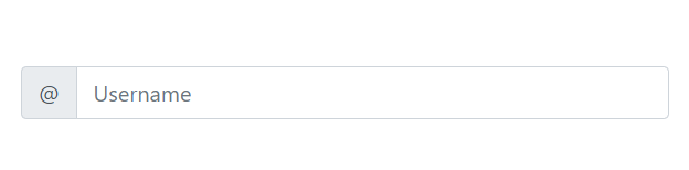
ในตัวอย่างนี้ ฟิลด์ป้อนข้อมูลมีสัญลักษณ์ “@” เพื่อแสดงว่าผู้ใช้ควรกรอกชื่อผู้ใช้
Input Group พร้อมปุ่ม
<div class="input-group mb-3">
    <input type="text" class="form-control" placeholder="Recipient's username" aria-label="Recipient's username">
    <div class="input-group-append">
        <button class="btn btn-outline-secondary" type="button">Button</button>
    </div>
</div>
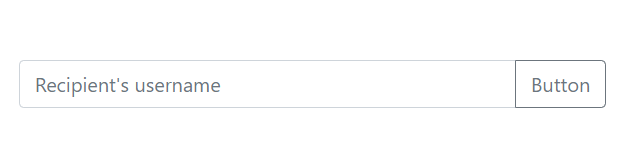
ตัวอย่างนี้เป็นฟิลด์การป้อนข้อมูลที่ผู้ใช้สามารถกรอกชื่อผู้รับได้ พร้อมปุ่มที่สามารถกดเพื่อทำการกระทำ เช่น ส่งข้อมูล
Input Group พร้อมส่วนประกอบที่หลากหลาย
<div class="input-group mb-3">
    <div class="input-group-prepend">
        <span class="input-group-text">$</span>
    </div>
    <input type="text" class="form-control" aria-label="Amount (to the nearest dollar)">
    <div class="input-group-append">
        <span class="input-group-text">.00</span>
    </div>
</div>
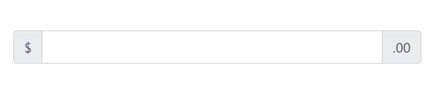
ในตัวอย่างนี้ ฟิลด์การป้อนข้อมูลใช้เพื่อกรอกจำนวนเงิน โดยมีสัญลักษณ์ “$” ที่ด้านหน้าและ “.00” ที่ด้านหลัง เพื่อให้ผู้ใช้เข้าใจว่าเขากำลังกรอกข้อมูลจำนวนเงิน
Input Group Sizing
Input Group Sizing ช่วยให้เราสามารถปรับขนาดของ Input Group ได้ตามต้องการ โดยใช้คลาสที่กำหนดไว้เพื่อให้ฟิลด์ป้อนข้อมูลและองค์ประกอบอื่น ๆ มีขนาดเล็กหรือใหญ่ตามที่ต้องการ
คลาสสำหรับปรับขนาด Input Group
input-group-sm: ใช้สำหรับ Input Group ขนาดเล็กinput-group-lg: ใช้สำหรับ Input Group ขนาดใหญ่- ไม่มีคลาส: จะเป็นขนาดปกติ
Input Group ขนาดปกติ
<div class="input-group mb-3">
    <div class="input-group-prepend">
        <span class="input-group-text" id="basic-addon1">@</span>
    </div>
    <input type="text" class="form-control" placeholder="Username" aria-label="Username" aria-describedby="basic-addon1">
</div>
Input Group ขนาดเล็ก
<div class="input-group input-group-sm mb-3">
    <div class="input-group-prepend">
        <span class="input-group-text" id="inputGroup-sizing-sm">@</span>
    </div>
    <input type="text" class="form-control" placeholder="Small Username" aria-label="Small Username" aria-describedby="inputGroup-sizing-sm">
</div>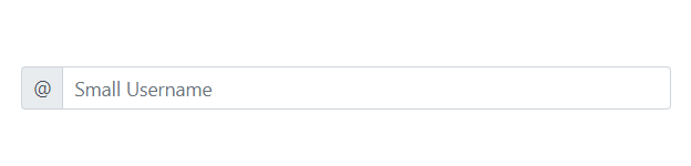
Input Group ขนาดใหญ่
<div class="input-group input-group-lg mb-3">
    <div class="input-group-prepend">
        <span class="input-group-text" id="inputGroup-sizing-lg">@</span>
    </div>
    <input type="text" class="form-control" placeholder="Large Username" aria-label="Large Username" aria-describedby="inputGroup-sizing-lg">
</div>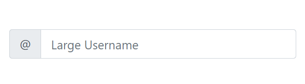
Multiple Inputs and Helpers
Multiple Inputs and Helpers ช่วยให้เราสามารถสร้างฟอร์มที่มีฟิลด์การป้อนข้อมูลหลาย ๆ ฟิลด์ในกลุ่มเดียวกันได้ นอกจากนี้ยังสามารถใช้ข้อความเสริม (helpers) เพื่อให้ข้อมูลหรือคำแนะนำเพิ่มเติมเกี่ยวกับแต่ละฟิลด์ ซึ่งจะช่วยปรับปรุงประสบการณ์ของผู้ใช้ในการกรอกข้อมูล
วิธีการใช้งาน Multiple Inputs and Helpers
- ใช้ Input Group: สร้าง Input Group สำหรับแต่ละฟิลด์การป้อนข้อมูล
- เพิ่มข้อความเสริม: ใช้
<small>หรือ<span>เพื่อเพิ่มข้อความที่เป็นคำแนะนำหรือข้อมูลเพิ่มเติมใต้ฟิลด์การป้อนข้อมูล
ตัวอย่างการใช้งาน Multiple Inputs and Helpers
Multiple Inputs
<div class="container mt-5">
    <h2>ฟอร์มการลงทะเบียน</h2>
    <form>
        <div class="input-group mb-3">
            <div class="input-group-prepend">
                <span class="input-group-text">ชื่อ</span>
            </div>
            <input type="text" class="form-control" placeholder="กรอกชื่อของคุณ" aria-label="ชื่อ">
        </div>

        <div class="input-group mb-3">
            <div class="input-group-prepend">
                <span class="input-group-text">อีเมล</span>
            </div>
            <input type="email" class="form-control" placeholder="กรอกอีเมลของคุณ" aria-label="อีเมล">
        </div>

        <div class="input-group mb-3">
            <div class="input-group-prepend">
                <span class="input-group-text">หมายเลขโทรศัพท์</span>
            </div>
            <input type="tel" class="form-control" placeholder="กรอกหมายเลขโทรศัพท์" aria-label="หมายเลขโทรศัพท์">
        </div>

        <button type="submit" class="btn btn-primary">ส่งข้อมูล</button>
    </form>
</div>
Multiple Inputs with Helpers
<div class="container mt-5">
    <h2>ฟอร์มการลงทะเบียน</h2>
    <form>
        <div class="input-group mb-3">
            <div class="input-group-prepend">
                <span class="input-group-text">ชื่อ</span>
            </div>
            <input type="text" class="form-control" placeholder="กรอกชื่อของคุณ" aria-label="ชื่อ">
        </div>
        <small class="form-text text-muted">โปรดกรอกชื่อจริงของคุณ</small>

        <div class="input-group mb-3">
            <div class="input-group-prepend">
                <span class="input-group-text">อีเมล</span>
            </div>
            <input type="email" class="form-control" placeholder="กรอกอีเมลของคุณ" aria-label="อีเมล">
        </div>
        <small class="form-text text-muted">เราจะไม่แชร์อีเมลของคุณกับใคร</small>

        <div class="input-group mb-3">
            <div class="input-group-prepend">
                <span class="input-group-text">หมายเลขโทรศัพท์</span>
            </div>
            <input type="tel" class="form-control" placeholder="กรอกหมายเลขโทรศัพท์" aria-label="หมายเลขโทรศัพท์">
        </div>
        <small class="form-text text-muted">โปรดกรอกหมายเลขโทรศัพท์ที่ติดต่อได้</small>

        <button type="submit" class="btn btn-primary">ส่งข้อมูล</button>
    </form>
</div>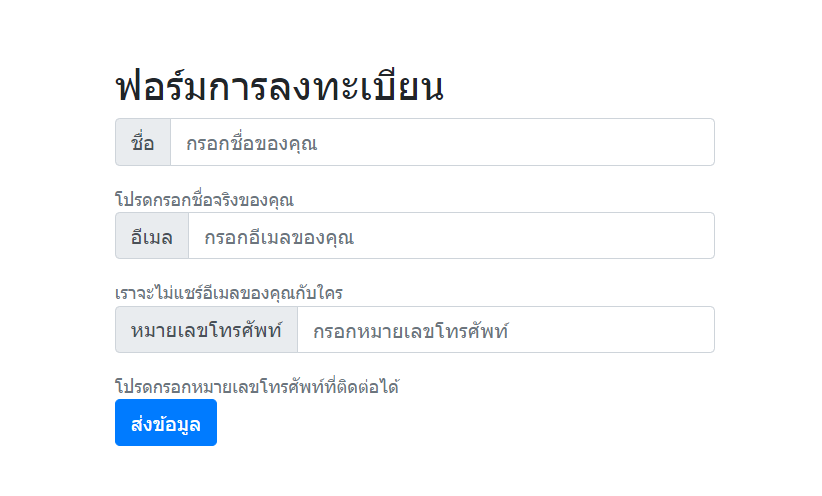
Input Group with Checkboxes and Radio
เราสามารถรวมฟิลด์การป้อนข้อมูลประเภท Checkbox หรือ Radio เข้ากับ Input Group ได้ ซึ่งจะทำให้การออกแบบฟอร์มมีความเป็นระเบียบและเข้าใจง่ายขึ้น โดยเฉพาะในกรณีที่ต้องการให้ผู้ใช้เลือกตัวเลือกต่าง ๆ ร่วมกับข้อมูลที่ต้องกรอก
Input Group with Checkboxes
<div class="container mt-5">
    <h2>ฟอร์มการสมัครสมาชิก</h2>
    <form>
        <div class="input-group mb-3">
            <div class="input-group-prepend">
                <span class="input-group-text">เลือกสิทธิ์</span>
            </div>
            <div class="input-group-append">
                <div class="form-check">
                    <input class="form-check-input" type="checkbox" id="option1">
                    <label class="form-check-label" for="option1">ตัวเลือก 1</label>
                </div>
                <div class="form-check">
                    <input class="form-check-input" type="checkbox" id="option2">
                    <label class="form-check-label" for="option2">ตัวเลือก 2</label>
                </div>
            </div>
        </div>
        <button type="submit" class="btn btn-primary">ส่งข้อมูล</button>
    </form>
</div>
Input Group with Radios
<div class="container mt-5">
    <h2>ฟอร์มการสมัครสมาชิก</h2>
    <form>
        <div class="input-group mb-3">
            <div class="input-group-prepend">
                <span class="input-group-text">เลือกเพศ</span>
            </div>
            <div class="input-group-append">
                <div class="form-check">
                    <input class="form-check-input" type="radio" name="gender" id="male" value="male">
                    <label class="form-check-label" for="male">ชาย</label>
                </div>
                <div class="form-check">
                    <input class="form-check-input" type="radio" name="gender" id="female" value="female">
                    <label class="form-check-label" for="female">หญิง</label>
                </div>
            </div>
        </div>
        <button type="submit" class="btn btn-primary">ส่งข้อมูล</button>
    </form>
</div>
Input Group Buttons
<div class="container mt-5">
    <h2>ฟอร์มสมัครสมาชิก</h2>
    <div class="input-group mb-3">
        <input type="email" class="form-control" placeholder="กรอกอีเมลของคุณ" aria-label="อีเมล">
        <div class="input-group-append">
            <button class="btn btn-success" type="button">สมัครสมาชิก</button>
        </div>
    </div>
</div>
Input Group with Dropdown Button
<div class="container mt-5">
    <h2>ฟอร์มเลือกตัวเลือก</h2>
    <div class="input-group mb-3">
        <input type="text" class="form-control" placeholder="กรอกข้อมูลของคุณ" aria-label="ข้อมูล">
        <div class="input-group-append">
            <div class="btn-group">
                <button type="button" class="btn btn-outline-secondary dropdown-toggle" data-toggle="dropdown" aria-haspopup="true" aria-expanded="false">
                    ตัวเลือก
                </button>
                <div class="dropdown-menu">
                    <a class="dropdown-item" href="#">ตัวเลือก 1</a>
                    <a class="dropdown-item" href="#">ตัวเลือก 2</a>
                    <a class="dropdown-item" href="#">ตัวเลือก 3</a>
                </div>
            </div>
        </div>
    </div>
    <button type="submit" class="btn btn-primary">ส่งข้อมูล</button>
</div>- ฟิลด์การป้อนข้อมูล:
<input type="text" class="form-control" placeholder="กรอกข้อมูลของคุณ">ใช้สำหรับกรอกข้อมูล - ปุ่มดรอปดาวน์:
<button type="button" class="btn btn-outline-secondary dropdown-toggle" data-toggle="dropdown">ตัวเลือก</button>ใช้สร้างปุ่มดรอปดาวน์<div class="dropdown-menu">ภายในนี้จะเป็นรายการตัวเลือกที่ผู้ใช้สามารถเลือกได้